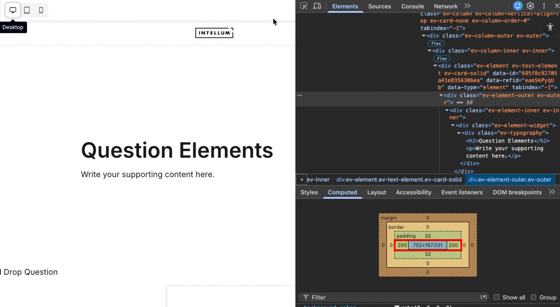
I have a section in which I’ve set “Design - Card - Solid”. In the Theme setting I’ve set Card to have 200px left and right horizontal Gap, but only for Desktop mode. For Tablet I’ve set this to 12px left and right. Now, in preview mode (on a PC) lookin in Tablet mode, it uses the 200 px Horizontal Gap!
I’ve even tested it using a second browser tab in preview mode while changing the Horizontal Gap setting in the main browser tab in Theme editor for Desktop mode, and, yes, the gap for Desktop mode IS USED in Tablet mode on the second screen.
(I haven’t got a real Tablet in the office, so I do not know if this behaviour is only in preview or also on the real device.)