the whole course now has this white space on the right. I have tried comparing side by side next to its sister course, and there is no obvious difference in the setups.
Please help me. I obviously want equal white space.
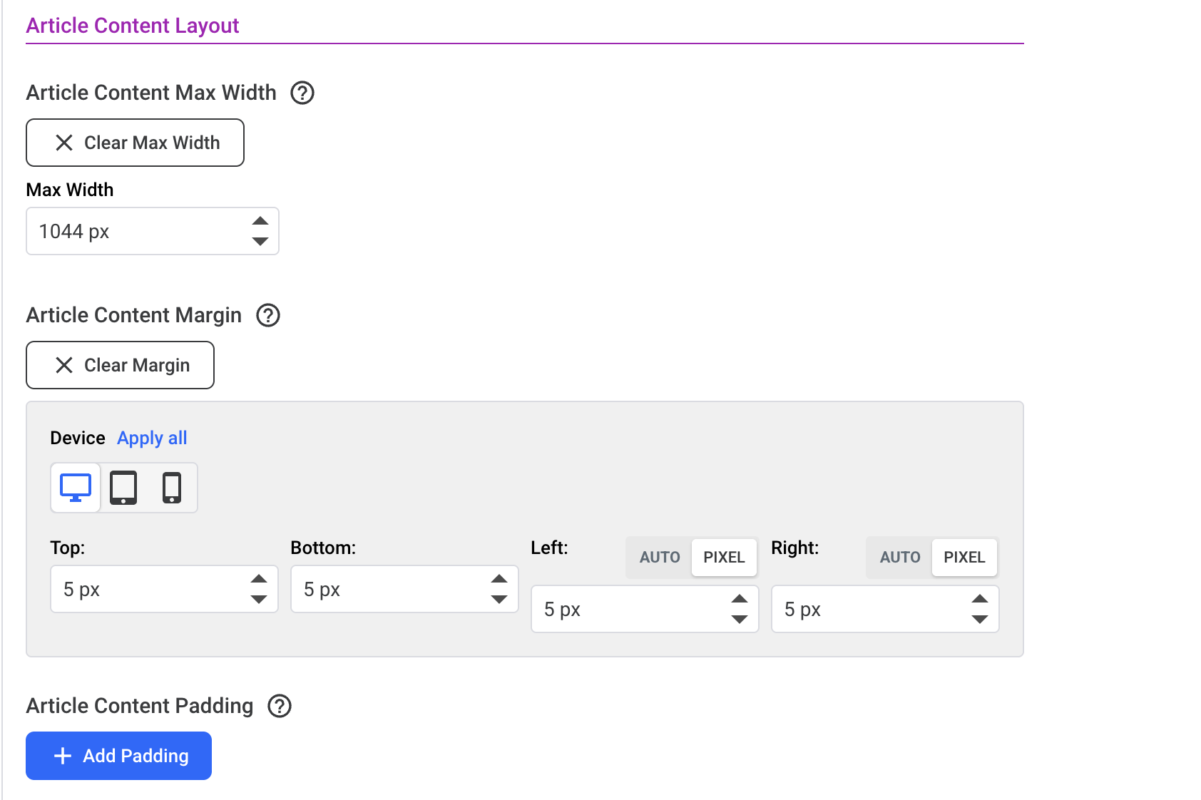
And further down, your Article CONTENT has a max width of 1024px, which is fine, but the Margin for Left and Right as seen below needs to be set to Auto for both, otherwise the content will obey the left margin (5px) and try to obey the right one too, but because it is limited to 1024pm it won’t stretch out.
Action: Set the below two margin settings to Auto and bingo! Centred. Then, if you want less padding either side, set the Max Width setting seen below to wider (or if you prefer, bring down the value in the top setting for Article Layout - to make the container narrower).